Design is one of the most critical elements of selling a product or service. But if last week’s post taught us anything, it’s that it’s particularly important for software companies. Software can be complex to explain. And visual elements are a tool that can make confused customers feel confident and able.
To give you even more inspirational ideas on how to use design in order to explain and sell your product, we bring you: 5 more incredible design ideas for product page victory.
1. What’s next?
It’s absolutely crucial to add a call to action. This achieves 2 things: it guides your user through a number of steps so that you can discover more information about them and move them towards a purchase or a free trial.
There’s no magic button that works every time, but ultimately it should pop among the rest of your content – you need to use a stand-out colour and action-oriented language to encourage immediate action.
2. Look here
Visual hierarchy is a vital principle in designing aesthetically strong and functional websites. This describes the order that the eye sees the information. Decide where you want the user to click and which areas of your website are most important, using elements such as size and colour.
The Gutenberg rule — is a concept that represents ‘reading gravity — which is the western reading habit of reading left to right, top to bottom. The diagram shows how the eye would naturally glance in this pattern, ending up on the lower right section of the page – which is a good area to think about placing your call-to-action.
A well-constructed interface should guide users from one action to the next seamlessly, such as FreshBooks, found below. It makes sense to keep your value propositions at the top, with quick links to learn about features and finish with the logical next step of a demo or purchase.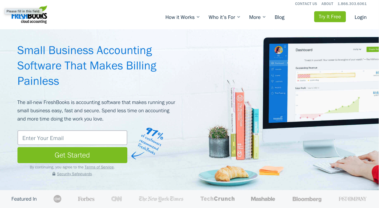
3. Selling points
Prevent choice paralysis. This happens when the user is given too many options. Simplify their options and show a clear and smooth path to the finish line. Show the user why they should choose your software over another similar product.
Present your unique point of difference. They shouldn’t need to spend too much time deciding which option best suits them. You can use visuals to show the most popular pricing option to help make the process even quicker.
Hicks’ Law states that every additional choice requires extra time to make a decision. Limit the user’s options and distractions, and you will find that the user has a quicker and smoother experience navigating your website.
4. Price it up
Being upfront and transparent about your pricing can accelerate your sales process. A well-design pricing structure has the potential to engage strongly with your customer. It can also eliminate tyre-kickers who would otherwise waste valuable sales resources.
Use visual design to steer your buyer to the most popular price point by highlighting it or by pulling it out of the design, as demonstrated below. Keep these pages clean and clutter-free to make a big decision with loaded options easier on your potential customer. The below example uses colour to quickly distinguish one plan from the other. Olark does a great job here.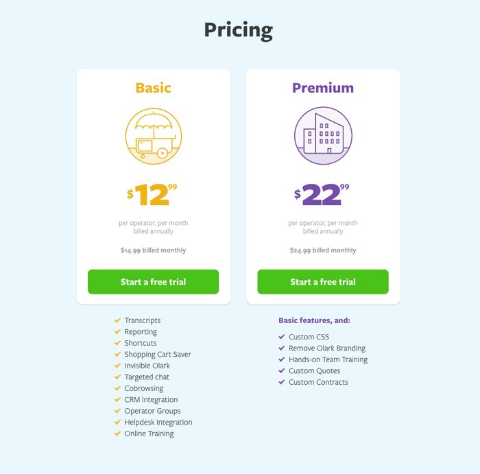
5. Trust me
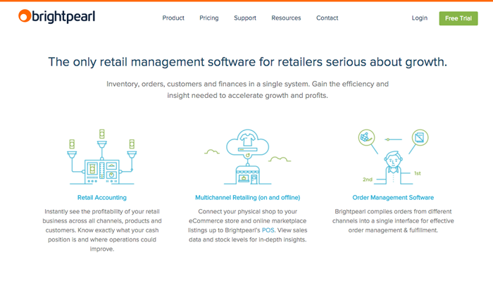
Saying Trust Me to a prospective customer is about as useful as a chocolate fireguard. Let your customers do the talking instead. Include some of your most impressive client logos as a Trustmark that can instantly give your buyer the confidence that your software is safe to use. An instantly recognisable and credible client logo is a good indication that your product is trustworthy. See Brightpearl’s approach below. Testimonials will also do this job for you. Let your loyal customers rant and rave about how good your product is! They will have great insights to the in-and-outs of your product and potential customers will take note of their advice.